

[vc_row][vc_column][vc_column_text]
Colour Psychology and the Web
Ever wonder why the word “SALE” is nearly always in the colour red? Colour psychology, the way people react, consciously or unconsciously, can help your business.
Colours can affect your mood, customer spending habits and the urgency with which a message is conveyed.
Colours influence the way in which a customer perceives a brand. When you think of Harley Davidson what colours come to mind? I bet bright pink isn’t amongst them. Calming, sedate colours aren’t really what is used. More likely you thought orange, chrome, black or blue, colours which are more associated with robust, hard-wearing, strength and toughness.
Yellow on the other hand is often associated with happiness, vibrancy. A bold colour like yellow, red or orange grabs a customers attention, but should be used very sparsely. In fact it’s recommended no more than 20% of a design, if you are using these colours on a sales or squeeze page, should be made up of these colours. Otherwise the effect is likely to agitate and drive customers away rather than convey a sense of urgency or importance.
Lets take an example, the opening line of this article referenced “SALE” and how it nearly always appears in red.

If not the text then the background is red. This small amount of red armed with a Call to Action which references a limited time offer. For example Limited time discount available for the first 10 people through the doors.
Known colour iinfluences
Red is the colour of excitement and action. It helps influence people to take an action, so when it is combined with the word sale and the information that the sale is for a limited time it helps encourage people to go to the sale and spend.
Blue on the other hand is a colour that helps elicit a feeling of trust and security in a brand. Think Skype, Facebook, twitter or Linked-in here.
Green is similar to blue in that it has a soothing, calming effect and therefore can be used in the same way as blue, to reassure and encourage trust. Common brands that use green are John Deere, BP, Spotify, and Land rover.
Yellow is the colour of energy. Similar to red but used to create feelings of happiness, encourages communication and shows clarity.
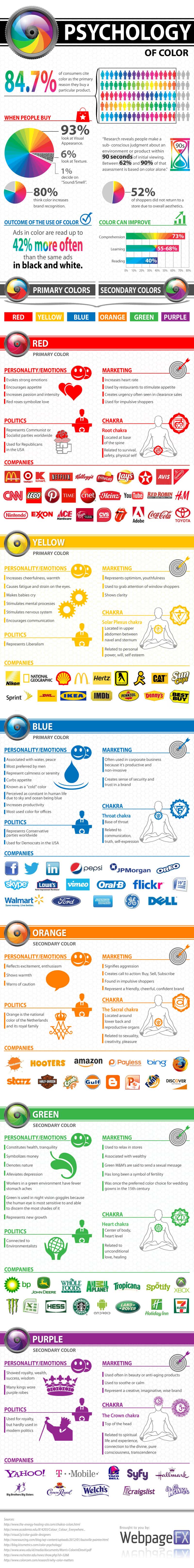
Looking for more colours? Have a look at the infographic at the bottom of this article.
An effective example using the colours above on a website sales page would be using a small count down timer in red, with a blue caption saying “limited XX available – book now”.
The red combined with the count down timer invokes a sense of urgency. The text would invoke the scarcity principle and using the blue colour would help invoke a sense of trust in that statement.
Colour Names
It has also been shown that not only does colour psychology come in to affect with the colour itself but the name given to those colours also has an affect on people as well.
As an example in a study done in 2006 (4) people where asked to assess different products that were using different colour names, out of this it was found that Mocha was considerable more desirable than Brown.
It seems people rate colours more favourable when they are given more detailed or fancy names and has been shown to apply to different products and ranges. And it has also been shown (5) that unique or elaborate colour names are more likely to have customers prospect of making a purchase increase.
Colours and your Brand
What does this mean for your website and brand online ?
You will have to keep in mind that many things go into influencing a customer and colour psychology is just one of many variables that can have an impact on their choices.
Though in a highly competitive market, trying to get clients through the door and making a sale this type of an advantage can be one of the deciding factors.
The right colour pairing, display and highlighting can make your brand more visible online. It can help great a sense of urgency in the case of a sale or help build trust and happiness in the case of building a long term relationship.
There are many ways to apply colour psychology with the other known principles of sales to help with conversions on your website. If you would like help in creating a landing page or sales page for your business contact us.
[/vc_column_text][/vc_column][/vc_row][vc_row][vc_column][vc_column_text]Click for a bigger Image
[/vc_column_text][/vc_column][/vc_row][vc_row][vc_column][vc_column_text]Further research
- https://blog.vendhq.com/post/64901824540/retail-psychology-use-colors-shapes-convert-shoppers
- https://www.shopify.com/retail/119923395-why-all-sale-signs-are-red-the-science-of-color-in-retail
- http://www.entrepreneur.com/article/233843
- http://onlinelibrary.wiley.com/doi/10.1002/mar.20142/abstract
- http://www.jstor.org/stable/10.1086/429602?seq=1#page_scan_tab_contents
- https://en.wikipedia.org/wiki/Color_psychology#Color_preference_and_associations_between_color_and_mood
[/vc_column_text][/vc_column][/vc_row]